
Type
Type is a multiplayer AI workspace where teams and agents work together, not one at a time in separate chat windows. Little Plains built the brand from the ground up: verbal strategy, visual identity, motion direction, and an agent-readable atomic system delivered as the launch kit.
On every team today, someone is using AI well, and someone else can't see what they're doing. The best work often lives in one person's chat history.
Type's founding team, drawn from companies that led some of the most-used collaborative products in the world, saw the same pattern at scale: AI was transforming individual output while team output stayed stuck behind the same old coordination ceiling.
Type needed to enter the market at the moment AI collaboration was becoming real, with a brand that didn't feel like another AI tool.
The audience wasn't just developers; it was the ops lead, the support manager, the marketing person watching someone else get more done and wondering when it would be their turn.
Where does Type live relative to everything else? Agents are everywhere. Many tools have one now. The challenge isn't having agents; it's that they live in separate rooms.
Type is where agents and teams work together. We spent time ruling out positioning frames that put Type in competition with the agents themselves before arriving at the one that put it above them.
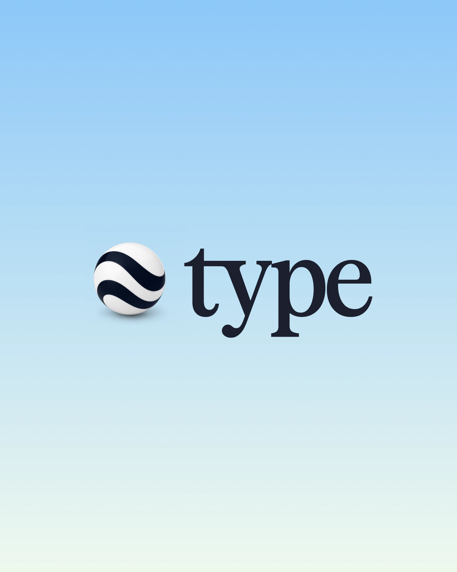
The mark represents multiple forces converging. The marble is familiar and cosmic at once. Marbles are physical, tactile, and little universes unto themselves. That's not usually how B2B SaaS brands think about their iconography, which is what we wanted.
The wordmark pairs a lowercase serif 'type' with the marble mark. The tension between the playful 3D mark and the grounded, classical letterforms is what gives the lockup its character.
The marble system became the visual language direction for the brand. The node-based generative workflow in Flora produced a family of unique outputs from one base logic, delivered as a reusable technique rather than a set of static files.
The marbles float, stack, and group. They live in the background of the gradient fields and in the product as agent avatars.
The motion system specifies easing curves and transition speeds that give the spheres their physical weight: elements enter fast and decelerate smoothly, then settle without overshoot.
The motion specs were delivered as a JSON file and as an interactive HTML component the team could feel rather than just read. Every piece was designed to be ingested by an agent as instructions, not just consulted as documentation.
Each agent loading, each thread appearing, each hover state maps to one of four curves.
The final package shipped in two folders.
- The /human folder contains the brand strategy deck, guidelines PDF, and Figma files.
- The /agent folder contains all assets encoded as instructions spanning positioning, voice, and audience in Markdown and YAML; colors, typography, and components in CSS and HTML; motion in JSON; marble assets as SVG and PNG.
Type's team could pull the kit into their editor, run a prompt, and see a near-complete landing page prototype come together the same day. This included correct fonts, working hover states, production copy, motion that matched the spec.
Type launched with the brand live in the product, with the founding team building from the atomic kit directly in their codebase.
The system shipped as working code, and the talented Type team kept extending it from there.
See the full experience at type.com.

Little Plains Team
- Caroline Bel-Kher
- Product Management Director
- Olivia Mann
- Creative Product Manager
- Jonathan O'Brien
- Brand Designer
- Avery Houser
- Brand Strategy
- Kenneth Lian
- Brand Director
- Emmett Shine
- Creative Director
- Alex Leiphart
- Head of Product
- Michelle Riis
- Account Manager
- Laura Romero
- Operations