


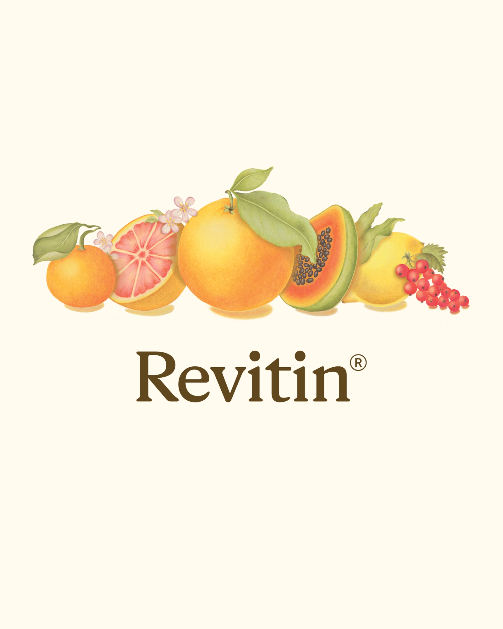
Revitin
Revitin is the world’s first prebiotic toothpaste, founded by NYC dentist Dr. Gerry Curatola to nourish, not sterilize, the oral microbiome.
We rebranded and relaunched the company, turning a science-backed formula into a beautiful, elevated oral care brand for a new generation.
Toothpaste hasn’t changed in over 60 years, with most brands still relying on harsh chemicals that kill the very microbes your mouths need.
Revitin had already built a loyal following around a microbiome-friendly formula, but its branding still looked clinical, and overly “Swiss medical.”
The challenge was to evolve it into something natural, premium, and trustworthy without losing its scientific roots.
Revitin’s formula reads like a recipe for health: tangerine, vitamin C, seaweed, cranberry seed oil, sea buckthorn, and vanilla.
We saw an opportunity to visualize those ingredients and bring warmth and life to the brand.
By blending art, science, and tactility, we wanted to turn brushing into a sensory ritual, something you’d actually look forward to, with natural ingredients you’re happy to have in your oral biome.
We partnered with artist and illustrator Sarah Bachman to bring the new identity to life and create a system that feels human, scientific, and alive.
After the original illustrations, we worked on the Revitin brand system, creating a natural feeling, and cohesive world. One that was warm, bright, but calming.
For typography we used Rizza Light for elegance and softness, and paired it with Basis Grotesque for clarity and balance. Revitin’s palette features greens, oranges, creams, and browns pulled from the ingredients themselves and our logo was designed to be timeless with quiet confidence.
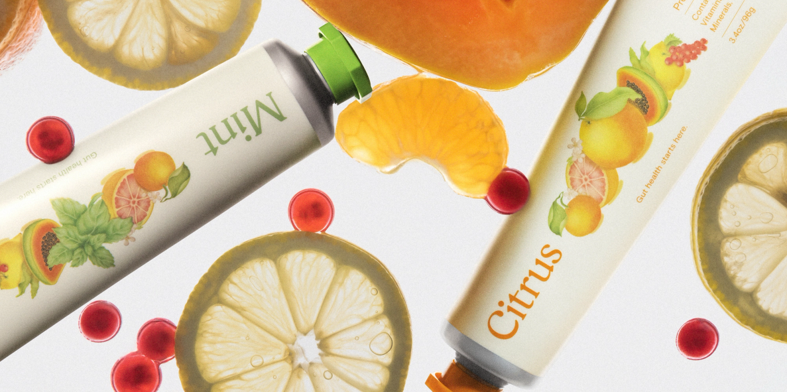
For their tubes, each of Revitin’s silver aluminum tube features a custom-colored cap to match its flavor. For the packaging, each box is printed on uncoated paper with embossing that highlights the illustrated ingredient bundles. This gave the products an approachable, yet elevated, feel.
Every tactile detail, from paper texture to emboss to cap tone, reinforces the natural integrity of the formula inside.
In partnership with honey.dev, we redesigned, and rebuild, the Revitin digital experience. For UI we honed in on circular and curved UI elements that feel organic and approachable. For shopping we emphasized fast, mobile-first checkout with subscriptions, bundles, and travel kits.
To help new users familiarize themselves with the brand we created an ingredient education hub explaining calcium carbonate, vitamins, and sea buckthorn. And for art direction, we shot original photography, from Irving Penn-inspired still lifes to on location warm lifestyle imagery.
Overall, we created an elevated, functional, and friendly e-commerce experience built to grow.
Since launch, Revitin has seen 5× revenue growth and built a full team through the Little Plains network, from performance marketers to e-commerce operators.
Dr. Gerry’s son Grant Curatola now leads operations, while Nick Kaplan’s team drives product and digital growth. More oral care innovations are already in development.
Revitin is redefining oral health, not by sterilizing the mouth, but by helping it thrive.
Little Plains Team
- Isabel Petty
- Creative Product Manager
- Laura Romero
- Creative Product Manager
- Sarah Bachman
- Art Director/Brand Designer
- Daniel Hunninghake
- Developer
- Alex Leiphart
- Head of Product
- Emmett Shine
- Creative Director