

Sonata
Sonata is healthcare built for your actual biology. It maps your whole genome, hundreds of biomarkers, and your cellular age, combined with a care team on top of that picture.
Little Plains worked closely with the founding team from Day 1 to help build the brand and the digital experiences. We oversaw naming, positioning, motion, art direction, web & product builds, all in the spirit of showing what it feels like when science becomes care.
Most healthcare is built for the average patient, who doesn't exist. You get reference ranges drawn from a population, a fifteen-minute visit, and a system that makes you repeat your story every time. Sonata's premise is that your biology is specific, so your care should be too. The founding question was how to make something this clinical feel personal rather than cold.
Our audience is anyone who's done the annual checkup, gotten the shrug and the "you're fine," and still feels like no one is looking at them. The Sonata user wants depth, intelligence, and they want a doctor.
The category splits into testing companies that explicitly aren't your doctor, traditional medicine that's reactive and generic, and concierge care that costs six figures.
Sonata sits where deep testing meets real doctors, at one price, for your complete life. We built the verbal system around that clarity, plain, declarative, and warm. "Your ranges, not the average." "We build a living model of you." We leaned into messaging that highlight Sonata’s specificity, instead of gesturing at wellness.
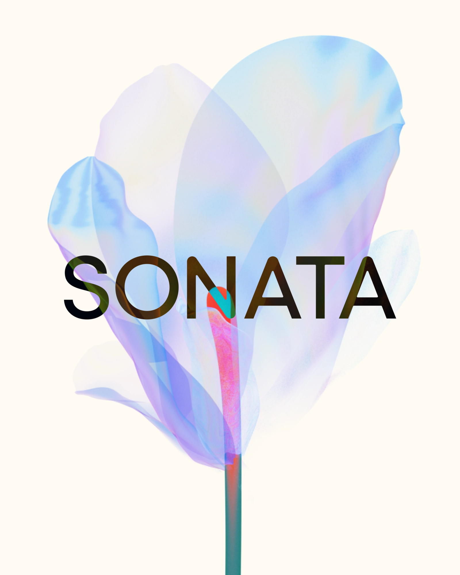
Sonata’s identity pairs a precise, confident wordmark with a palette pulled straight from the natural world: petal blues, sunset corals, and soft greens.
The brand’s color was built upon ‘cosmic latte’ - which is ‘the average color of the galaxies of the universe as perceived by a typical human observer from the position of the Earth.’
We leaned into the iridescent wash you see across this flower. The flower itself, a Calla Lily caught in cross-process color, became the brand's emblem. It's biological without being clinical, beautiful without being soft. The colors, content and visuals do the warming so the type can stay exact.
We used a custom node-based generative workflow to create not only one static cross-processed flower, but a range of flowers, and a range of static and motion-based assets. We then turned over the workflow ‘techniques’ to the client so that they could create and edit on their own.
Little Plains worked closely with the founding team to create, test, and build a comprehensive ‘atomic kit’ of brand elements for digital. Sonata has many userflows once a customer is logged in, and had to be exactingly precise with private data.
We didn’t want to compromise on beautiful imagery and UX, so we had to produce detailed brand & product guidelines down to the finest of details, and most specific of use cases.
Sagan, the founder, had a product background and pushed our team to prototype early and often. This helped Sonata get out of theory and into real UX, fast. We collectively tested away for months, leading to the matured, intuitive interface the business offers today.
Motion and choreography became incredibly important on Sonata. For disruptive businesses you are often trying to say so much, in such a short amount of time and space. You want a user to be able to rethink and relook at a space they thought they knew, or didn’t know existed. And in a fraction of a second. Then when a user is in the experience, Sonata has to showcase a wide range of information, fast and without any voiceover.
Motion and content choreography were used to guide users through dense pockets of information for both logged out and logged in states.
Interface transitions move with a settled, unhurried weight and we treated movement as a clinical trust signal: a system with confidence shouldn’t need to shout or grab your attention. Instead it should guide you with grace and empathy.

Little Plains Team
- Caroline Bel-Kher
- Product Management Director
- Jenny Long
- Creative Project Manager
- Mark Progano
- Creative Product Manager
- Madeline Macartney
- Creative Product Manager
- Dan Batten
- Content & Art Director
- Avery Houser
- Strategy Director
- Nick Ceglia
- Brand Strategy Advisory
- Melanie Levitin
- Brand Strategy & Copy
- Taylor Simpson
- Brand Designer
- Elliot Robinson
- Sr. Digital Creative Director
- Paige Libadisos
- Product Designer, Design QA Lead
- Arthur Shim
- Product Advisor
- Anton Sten
- Product Advisor
- Jamal James Tobias
- Development
- Fabrizzio Zampieri
- Developer
- Christopher Bolliger
- Designer & Developer
- Amy Berkowitz
- Web & UX Copywriter
- Daniil Sergeev
- Product Designer / UI/UX Designer
- Daniela Nuñez
- UI/UX Product Designer
- Phillip McClure
- Graphic Designer
- Emmett Shine
- Creative Director
- Alex Leiphart
- Head of Product
- Michelle Riis
- Account Manager
- Laura Romero
- Operations