


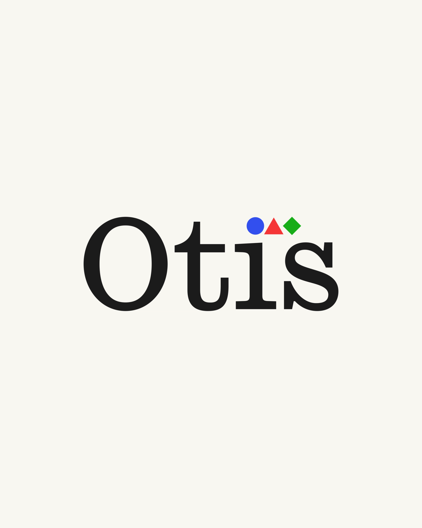
Otis
Otis is an AI-native product insight agent that sits inside the tools your team already uses. Founders Josh Greene, Tim Moreton, and Amy Slawson came to Little Plains with a product that was genuinely different and a brand that hadn’t caught up. We built the strategy, visual identity, messaging system, product UI direction, and sales deck from the ground up.
AI-native teams are sitting on a specific problem. Their users generate enormous signal: conversations are happening constantly, every prompt a window into what they’re actually trying to do. But almost none of that connects to what gets built next.
Today’s stack was designed for a world where users clicked buttons, not talked to AI; product analytics, observability, evals, and tickets each see a slice, but the richest signal in the product stays invisible.
For positioning we had to think carefully. “AI product manager” was instantly legible to AI-native teams, but sounded like back-office grunt work. “Agent” was everywhere and meant almost nothing.
We landed on a framing that let the product speak for itself: Otis shows up in your product and your Slack, not as a dashboard you visit, but as a colleague that’s already done the work. It arrives with answers, not asks, and the brand needed to hold that distinction without overstating it.
The name was legally Ortelis, which we shortened to 'Otis.' It’s short, human, and strong as a single syllable.
Otis carries the personality the product needed: direct, honest, no performance. Caslon Ionic set the typographic tone, a slab serif with historical weight and quiet authority, paired with GT America for everything functional and GT America Mono for eyebrows and CTAs. While simple, this pairing helped connote infrastructure and craft in the same voice.
The color system came from first principles with primary using RGB, warmed slightly. We referenced nautical and maritime icons and landed on blue for observe, red for setting course, and green for act.
Each color maps to a meaning in the product, and those meanings carry through everywhere Otis appears, including the contexts where the brand has no control over the environment: Slack, email, plain text, a terminal. We built for those surfaces first.
Because the product lives mostly in Slack and increasingly in coding environments via MCP, we built a parallel symbol layer using Unicode glyphs exclusively. Instead of icons or custom SVG, we went with global characters that survive copy-paste into any context.
⊙ for insight
◉ for takeaway
⊹ for snapshot
⁘ for narrative
Each glyph maps to a concept in the product, color-coded in the UI, plain-text legible everywhere else. This was designed so ‘the brand’ works in the wild, not just in the design files.
We continued pushing a cohesive narrative across all touch points. For Otis, one shape is a mark, and a field of shapes is a journey: weeks of decisions, patterns building, the shape of a founder who's been running the loop.
Teams can efficiently observe, set course, act, and repeat.
The final deliverables include motion direction for how this journey is expressed on marketing surfaces, symbols building and resolving as the founder moves through the cycle.
The deck gave the work a place to prove itself with ten pages, leading with Showroom as the anchor story. 85,000 signups arrived in a viral spike. Underneath them, a small cluster of users spoke a different language in their prompts: type scales, brand tokens, components by name. The deck leads with that story, not specs, and uses the shape-color system throughout as a navigational layer.
The full deliverable package included brand kit, logo suite, color and type system, art direction and motion direction, UI component kit, the sales deck, and agent-ready brand files in Markdown and YAML.
The language, visuals, and product surfaces are designed to pick up signal, respond to it, and get more specific with every release.
Otis is built to compound and so is the brand. Each new interaction, from a user question, a rewrite draft, to a workaround it uncovers, feeds back into the product and makes it sharper. We treated the brand the same way; it’s a system that learns and layers over time.
See the full experience at runotis.com.

Little Plains Team
- Caroline Bel-Kher
- Product Management Director
- Oliver Montgomery
- Creative Project Manager & Strategist
- Avery Houser
- Strategy Director
- Nick Sheeran
- Brand Designer
- Kenneth Lian
- Brand Director
- Alex Leiphart
- Head of Product
- Emmett Shine
- Creative Director
- Michelle Riis
- Account Manager
- Laura Romero
- Operations