
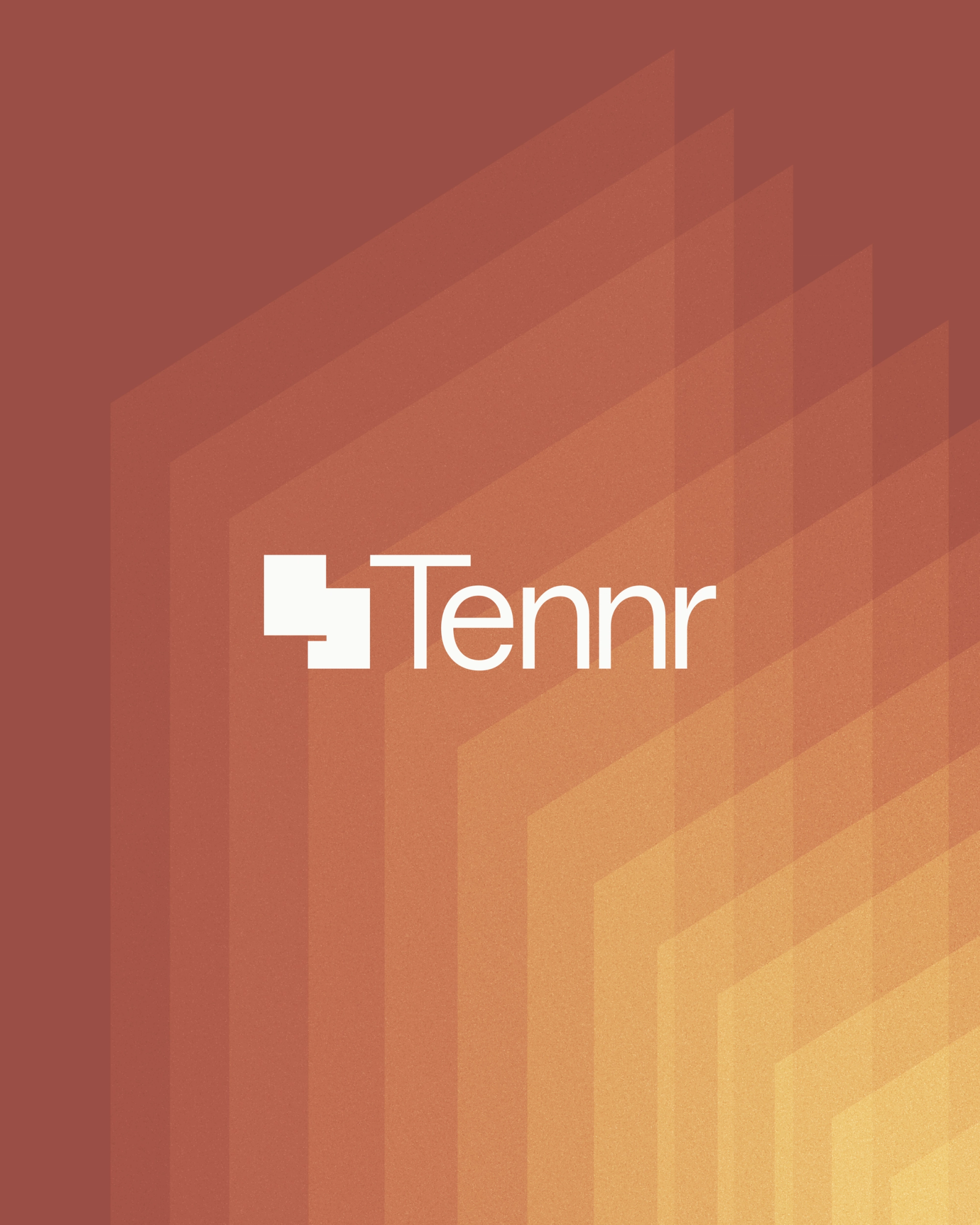
Tennr
Tennr is a healthcare automation company transforming messy referrals into seamless patient journeys. We rebranded and relaunched the company ahead of its Series C, creating a bold, frontier-inspired identity for the next era of healthcare tech.
Across U.S. healthcare, millions of referrals disappear every year. Faxed forms, PDFs, and manual follow-ups slow care and drain revenue. Tennr set out to fix the referral black hole, turning paperwork chaos into coordinated care.
Much of the medical referral industry in the U.S. still uses the antiquated system of fax machines.
The Tennr team built a vision-language model called RaeLM, designed to read, interpret, and route clinical documents automatically. It performs eligibility checks, prior authorizations, and patient engagement, all without human intervention. For healthcare, that means fewer denials, faster visits, and a seamless hand-off between providers and payers.
Backed by a16z Healthcare, Tennr’s founders came with the drive of engineers on the frontier: ambitious, practical, and fearless. We captured that Western spirit in a brand system that feels technical yet human, merging grit with grace.
The mark forms two overlapping sheets of paper, symbolizing the movement of information from fax to future. Clean, dimensional, and precise. We built the new Tennr wordmark using ABC Marfa Variable Light, pairing it with Feature Display, a nod to the Texas frontier.
The color palette pulls from the American Southwest: warm terracotta, mesa gold, and deep cactus green. Each tone carries sunlight and dust, creating a natural contrast to healthcare’s usual colder blues.
We built a rich color palette to convey Tennr's frontier energy. On the left is a photo of one of our designer's flannel, which we used as inspiration. On the right is the browned, rich ground native to much of the southwest.
Multi-color gradients conveyed the special interstitial hues of sunrise and sunset out west.
At the heart of Tennr’s identity is Cowboy Glass, our signature visual system inspired by the layered paperwork the company eliminates. Translucent planes overlap, bend, and repeat, creating a sense of depth, movement, and light. It became the visual core across every medium.
We came up with our 'Cowboy Glass' fractals by envisioning what 'paper' would look like in the far future. We wanted to move from the past reliance on fax machines, and point the industry to what could be next.
We created a set of planar, blueprint-style illustrations to visualize Tennr’s automation process. Each diagram mirrors the geometry of Cowboy Glass: clean, layered, and directional. In motion, they unfold like a sequence of intelligent choreography.
The Cowboy Glass motif is beautiful for emotional, hero moments, but for functional to technical messaging moments we needed a more precise system of visuals to explain how Tennr's unique system processes documents.
In digital, static designs are half the battle. Motion, choreography, and animation are where graphic design becomes interactive design. Thus, we needed to show how each asset would tell a story in a limited amount of space, and time.
The Tennr site was choreographed to feel calm, intelligent, and deliberate. Cowboy Glass fractals animate across pages as users scroll, creating quiet depth and focus. Built on Next.js and Vercel, the site balances technical precision with emotional clarity.
We worked with the Tennr team to rewrite their story, turning dense medical jargon into plain, confident language. Lines like “Automated prior-authorization eligibility workflows” became “From fax to first visit, faster.” Clear, human, and empathetic.
Our copy work focused on breaking down complex jargon and technical terms into digestible sentences that someone in the industry would understand, and appreciate.
We designed a motion system inspired by the principles of animation: elastic, precise, and expressive. The “Tennr Snap” defines how elements expand and settle, reflecting both technical confidence and human rhythm, …even buttons feel alive.
We wanted to showcase Tennr's attention to detail even at a marketing level. We continued the fractal throughline into CSS background elements, as well as hover states for buttons.
From digital to print, Tennr’s system scales effortlessly. Cowboy Glass, grain, and tone appear across white papers, trade booths, and ads. The identity performs in motion and stillness alike, proof that engineering and emotion can coexist.
We made sure the digital-first designed system was flexible enough to work across the entire user journey, including out-of-home, digital ads, and medium-form video.
The Tennr team has built upon the original brand world by rolling out great advertising and marketing initiatives.
~
Tennr proves that automation can have soul: intelligence shaped by empathy. The frontier spirit lives on in healthcare’s new landscape.
See the full experience at tennr.com.

Little Plains Team
- Caroline Bel-Kher
- Product Management Director
- Gordon Sexton
- UI/UX Design
- Andrew Janik
- UI/UX Design
- Camille Muson
- Copywriting/Brand Strategy
- Eri Miyagi(Eastern Rodeo)
- Art Direction
- Marissa Lim(Eastern Rodeo)
- Art Direction
- Elliot Robinson
- Motion Director
- Sasha Klu
- Development
- Steve Fuentes
- Development
- Dmitri Vassilev
- Development
- Arlen Peiffer
- Development
- Kevin Cabano
- Development
- Alex Leiphart
- Head of Product
- Emmett Shine
- Creative Director
- Michelle Riis
- Account Management
- Phillip McClure
- Production Design