


Baba Care
Loneliness in America is a public health crisis, as damaging as smoking fifteen cigarettes a day. For older adults, connection has become gated behind devices they were never designed for.
The healthcare startup Baba offers a simpler path back to connection, a voice companion that listens, learns, and cares, operating solely over phone calls.
Built by a team from Y Combinator, Stanford, MIT, and Johns Hopkins, Baba combines behavioral science with natural conversation, becoming a kind of modern familiar: assistant, secretary, and best friend in one.
Our task was to help Baba emerge as an empathetic, intelligent, and trustworthy brand, a presence families could rely on and clinicians could respect.
We positioned Baba as a caring AI sidekick that listens not just to what people say, but to how they sound. The voice of the brand had to balance clinical credibility with emotional warmth: part science, part soul.
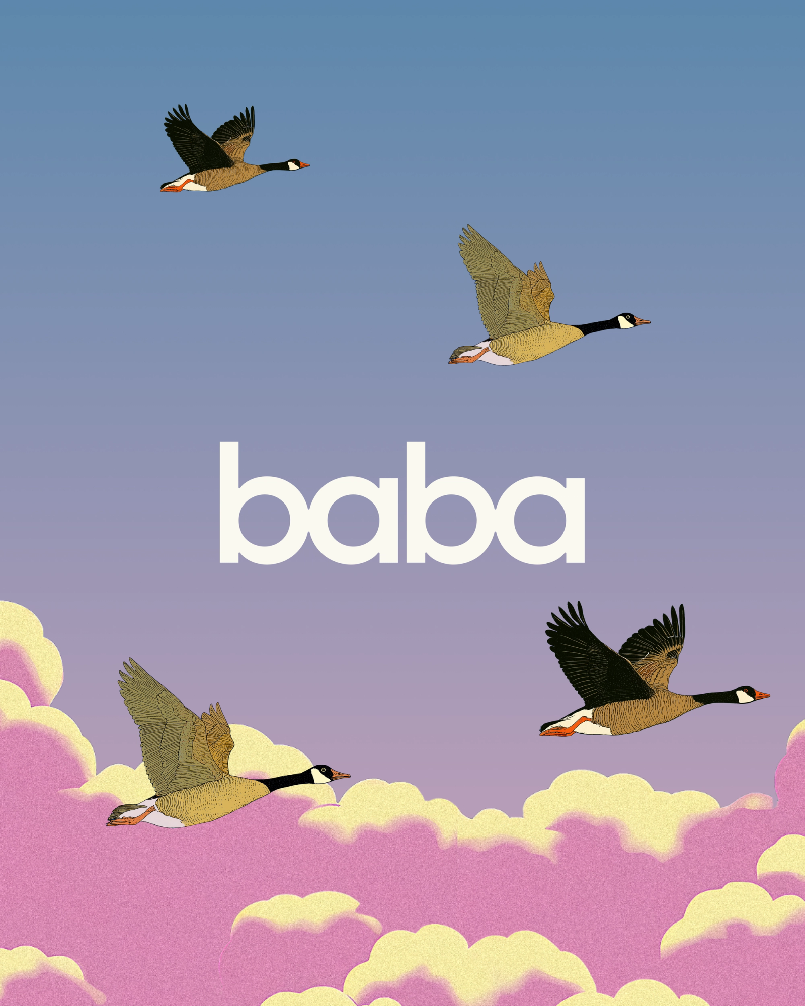
The world of Baba comes alive through a hand-drawn universe of birds, flora, and quiet landscapes.
Inspired by Japanese minimalism and early animation, the bird illustrations evoke companionship and care. Creatures that sing, connect, and carry messages.
Built through a blend of AI generation and custom linework, they extend the feeling of presence without noise.
We imagined Baba as a companion bird: intelligent, loyal, quietly observant.
The symbol is geometric yet soft: rounded forms, ascending rhythm, and a merged “b-a” ligature that embodies connection.
For the wordmark, we let the soft, repeating geometry of the lowercase b and a do the heavy lifting. Sometimes you just need to sit with the work and it presents itself to you.
The result is imagery that feels documentary, not stock: quiet proof that technology can look human.
The palette anchors Baba in calm and trust: navy, cream, and charcoal as core tones, with secondary hues of periwinkle, slate, and lavender sky. A visual nod to dawn conversations and late-afternoon light.
Typography pairs Fair Octave’s gentle serif warmth with GT Esti’s functional clarity, mirroring Baba’s union of empathy and intelligence.
We used AI-directed art to portray real people in candid, unposed moments, capturing dignity, warmth, and ease.
Baba was one of our first major rendered photography breakthroughs. We employed art direction, lighting, cropping, camera types, and real models.
The result is imagery that feels documentary, not stock; quiet proof that technology can look human.
For a fast-moving YC startup, flexibility was essential. We built a modular design system — web components, CTAs, cards, and content templates — that could scale from testing to production in weeks. Every piece follows the same rule: reduce friction, increase clarity.
At a lower level, we needed fast-loading and easy to use assets to help guide users through some of the technical parts of the journey.
The final site tells a calm, human story: “Navigating healthcare alone can feel exhausting. Imagine a health expert doing it for you.”
The launch website is spectacularly original. We storyboarded out a narrative, then laid in copy and visuals. Once everything was in place, we tested motion and choreography over
Since launch, Baba has resonated with families and care networks alike, proof that even in an age of AI, the most powerful interface is still the human voice.
Loneliness is heavy. Baba lightens the weight.

Little Plains Team
- Ann-Marie Sebastian
- Product Manager
- Kenneth Lian
- Lead Design & AD
- Nick Ceglia
- Brand Strategy
- Nicole Fernandez
- Copywriting
- Elliot Robinson
- Motion Design
- Christopher Bolliger
- UI/UX/Development
- Fabrizzio Zampieri
- Development
- Paige Libadisos
- QA
- Emmett Shine
- Creative Director
- Alex Leiphart
- Head of Product
- Michelle Riis
- Account Management
- Laura Romero
- Operations