

Rise Plasma
Rise Plasma is an American plasma-donation business built for the modern U.S. market. We partnered with the team to name, position, and design an uplifting brand experience for young adults looking to earn money while helping save lives.
Plasma donation centers are everywhere in the U.S., but the category feels cold, overly medical, and visually outdated. The typical experience is unwelcoming and unclear, even though plasma is vital for life-saving therapies. Young adults use these centers to supplement income, yet no brand speaks to them directly or respectfully.
Plasma plays a critical role in treating immune deficiencies, bleeding disorders, and trauma. Donors are usually young, healthy adults who have a few hours between shifts or classes.
The opportunity was to create a brand that feels positive, empathetic, and familiar. Something closer to a digital world they already live in, rather than a medical pamphlet.
Rise Plasma is positioned around a simple promise: Give plasma. Get paid. Do good.
The tone is direct, friendly, and never patronizing. Messaging focuses on impact (life-saving therapies) and practicality (extra cash for food, gas, apparel). We built an end-to-end framework covering name, voice, narrative, and personality.
Plasma donation is a way for many Americans to earn money while providing an invaluable resource for many in need locally and abroad. We wanted to create a world that shared that sentiment.
The naming process spanned multiple rounds of exploration, legal screening, and stakeholder workshops.
Rise captured everything: uplifting, positive, technically relevant, and flexible for future locations and campaigns.
The naming process about talking, thinking, collaborating, and brainstorming together. That’s what we did as a team, and with their team, to get to Rise Plasma.
The project took inspiration from video-game worlds and lush, imagined environments; digital spaces that feel calm, optimistic, and familiar to Gen-Z and young millennial donors.
Some key elements we brought in were sunrise and sunset gradients, glassmorphic layers and soft metal pins, 3D floating objects that create a sense of world-building, seasonal, location-specific landscapes, and cloud motifs and peaceful sky tones.
The typography system was balanced through using Dazzed Medium as our primary and Concrete M as our secondary.
We knew early on we wanted the launch website to showcase a world from the sky down to the earth, and needed the brand colors to represent this.
In doing research on the user base, we listened to what items they were saving up to purchase via plasma donation. Our team created friendly graphics of each, to show back to the audience.
We chose a sans-serif header font to create clear, legible copy, and then a serif to slow down the user for the more technical body copy.
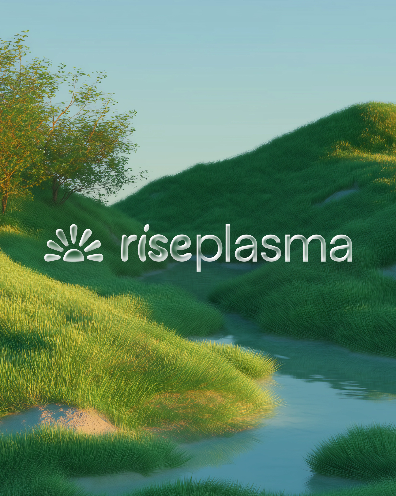
The logo is a compact sunrise symbol designed to scale across physical spaces, digital cards, and mobile UI. It’s flexible, memorable, and works as both a stand-alone mark and a lockup with the name.
We created a world of soft lighting, low-poly environments, bright skies, and calming nature cues. This visual language reframes plasma donation as something peaceful, safe, and empowering, not clinical.
AI-generated renders turned into videoscapes were used to showcase the natural environments of the chosen locations across the U.S.
To bring the project to life, we built a Webflow experience centered on a sunrise walkthrough of the donation process. The site explains how plasma becomes medicine, how donors get paid, and how to book an appointment, using clear steps and friendly language.
Even the mobile experience is fluid, fast, and built for Rise’s digital-first audience.
The resulting website features a combination of all elements coming together with fluid, smooth content-choreography to create a fast, informative scrolling experience re-introducing plasma donation to a new generation.
Rise Plasma uses agentic systems to automatically generate seasonal, location-specific graphics. Each center gets a visual identity that matches its environment, from winter tones in the Midwest to summer skies in the Southwest.
To make the renderings feel real, we researched each town Rise Plasma is opening in and modeled an ideal landscape based on real flora and fauna native to the area. We then created versions that are based on the weather across each season.
The brand was extended into environmental design through signage, wall graphics, donor cards, informational materials, and promotional items. Everything reinforces calm, warmth, and clarity.
To make the renderings feel real, we researched each town Rise Plasma is opening in and modeled an ideal landscape based on real flora and fauna native to the area. We then created versions that are based on the weather across each season.
Rise Plasma brings modern, empathetic design into a category that’s been underserved for decades. The brand speaks to young adults with respect and clarity, while helping more plasma reach the patients who rely on it.
Rise’s first locations launch with a full identity system, messaging framework, website, and visual world ready to scale nationwide.

Credits
- Michelle Thomas
- Product Manager
- Theresa Duemler
- Brand Designer
- Melanie Levitin
- Copywriter/Brand Strategist
- Dana Kingery
- UI/UX Design
- Marc-Antoine Gagnon
- Development
- Emmett Shine
- Creative Director
- Alex Leiphart
- Head of Product
- Michelle Riis
- Account Manager
- Laura Romero
- Operations