
Haven
Haven is a building platform for developers and general contractors: engineered wall panels, precision steel framing, and a managed energy network, sold and installed as one coordinated system instead of three separate vendors. The company came to us with a narrower story than the business it was becoming, so we repositioned it and built the identity, motion guidelines, art direction, and launch site around the platform it actually is.
The problem the platform solves starts with the numbers themselves. Construction labor productivity is down roughly 30% since 1970, while every other sector has gotten more efficient. By 2031, 41% of the construction workforce is set to retire. Home insurance premiums are up more than 40% since 2019, to an average of $3,303 a year. Buildings account for 40% of U.S. energy use. Haven's pitch to developers is that panels, steel, and power solve all four problems inside the wall assembly itself.
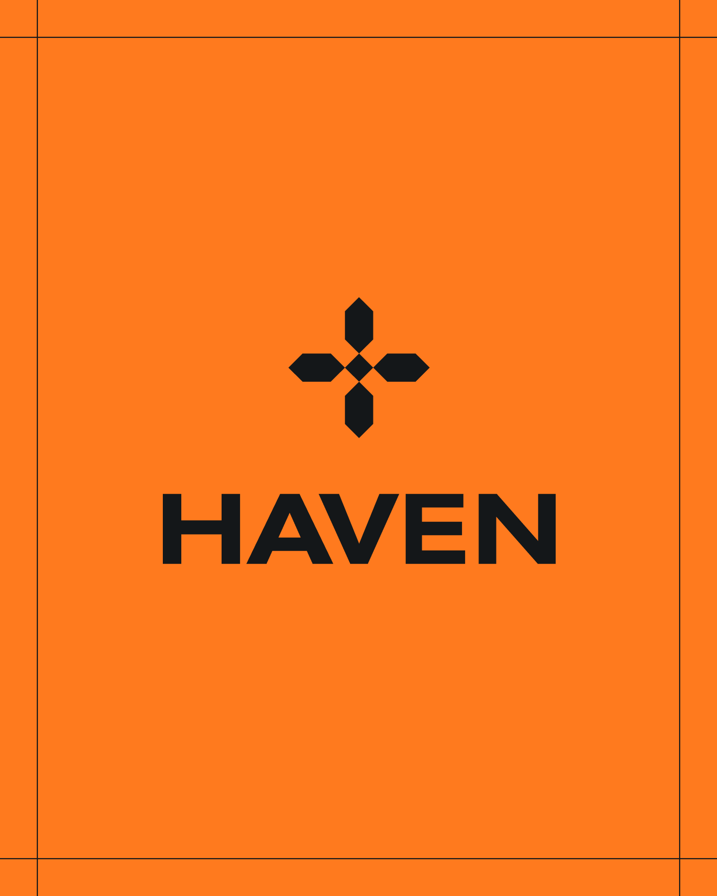
The mark is a four point form built from petal shapes around a single center, closer to a compass rose than a corporate glyph, which is where the name earns its keep. It sits above or beside "HAVEN" set in a bold, extended sans, and reduces to a single plus stroke at the smallest sizes, still legible at app icon scale. The wordmark carries the weight. The mark is the shorthand version of the same idea.
The architecture follows the master brand call from the early strategy work: everything ships as Haven first, then the product line. Haven Panels, Haven Power, Haven AI, and Haven Steel each get an icon built from the same mark logic: three bars for the wall system, a bolt for power, and two rectangles for steel. The structure leaves room to add a product line later without renaming anything that already shipped.
The wall system page makes the platform's clearest argument. Panels are delivered day one, framed and insulated within four days, dried in by day four, inspected by day six, and ready for MEP rough in by day seven. Underneath the timeline, the page argues its case in plain terms: no jobsite framing waste, energy performance that doesn't depend on a specialty framing crew, and a structure that doesn't carry wood's rising cost curve.
Haven Power argues the opposite case. The grid is aging and demand keeps climbing, so a home that produces and stores its own energy is worth paying for directly. The page opens on the strained grid, then closes on guaranteed savings against utility rates, backup power, and a system a developer installs once and never services again.
We built the palette, called Precision Infrastructure, around materials instead of moods. Carbon (#141719) reads as coated steel, not pure black. Structural Clay (#D8D2C8) and Cast Alloy (#8C9397) work as warm and cool neutrals borrowed from masonry and machined metal. Haven Orange (#F68638) is the one accent allowed to act like a safety marking, kept distinct from the construction yellow every competitor already uses.
Headlines run in Akzidenz Grotesk Ext Medium, set in all caps with tightened letter spacing. Body copy drops to GT America Regular with generous line height, built for long paragraphs about insulation values and MEP coordination. Eyebrows and CTAs use GT America Mono Bold, small and letter-spaced, like a spec sheet label.
We wrote the motion guidelines and art direction: the shot list, material specs, background tones, and build-stage sequence.
The result is a consistent set of isometric houses that move from bare frame to finished home, plus a close up render of the wall panel's steel connector and insulation joint, all matched to the same palette and lighting logic.
By the founding team's own estimate, roughly 80% of the site's argument is written for the developer and the GC, the people who actually decide what gets built, with the homeowner's benefits folded in underneath rather than leading. On the platform overview page, same-day design turnaround and a sequenced build kit are the two claims doing the most work.
Haven's site is live. The brand guidelines, motion specs, and art direction docs have been delivered and are already governing the renders and photography moving through production.

Little Plains Tream
- Caroline Bel-Kher
- Product Management Director
- Laura Mazzonna
- Creative Product Manager
- Rusty Meadows
- Creative Product Manager
- Avery Houser
- Strategy Director
- Sky Seo
- Creative Technologist
- Kenneth Lian
- Brand Director
- Dylan Blaty
- Brand Designer
- Sanghee Han
- UI/UX Designer
- Kevin Cabano
- Development
- Marc-Antoine Gagnon
- Developer
- Elliot Robinson
- Sr. Digital Creative Director
- Mads McCausland
- Motion Designer
- Emmett Shine
- Creative Director
- Alex Leiphart
- Head of Product
- Michelle Riis
- Account Manager
- Laura Romero
- Operations
- Leon Lee
- Brand Design Intern