
Camber
Our goal for this project was to help healthcare software feel calm. The business we renamed and relaunched helps medical practices reduce administrative burden and improve workflow efficiency.
To bring their vision of clearer, simpler healthcare to life for Americans, they partnered with Little Plains.
Camber (formerly Juniper) began in behavioral therapy billing before expanding into broader healthcare operations.
Their early brand got them to product-market fit, but leaned heavily on acronyms and insider language, making it difficult for clinics to quickly see the value.
A more distinctive, human identity was needed.
We repositioned Camber from a specialty tool into a comprehensive healthcare operations platform.
The new brand unifies visuals, naming, and messaging to express expanded capabilities while keeping the experience intuitive for busy healthcare teams.
Camber is a term for a subtle, intentional curve used to keep systems running smoothly, found in roads, lenses, and engineering.
It reflects balance, adjustment, and optimized performance.
The name positions Camber as a supportive force that improves healthcare operations with clarity and precision.
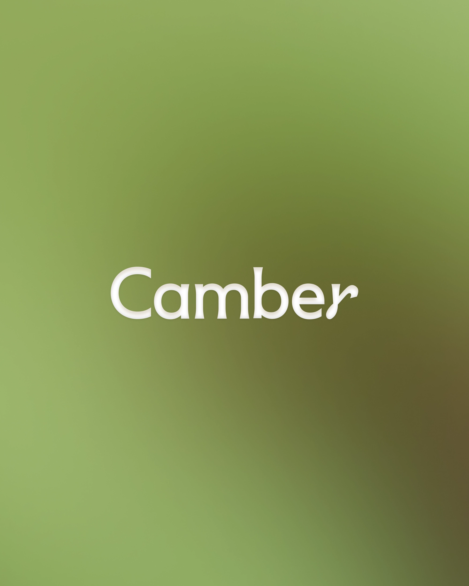
We created a custom wordmark featuring a modified gamma symbol (γ), a nod to intelligence, signal, and scientific precision.
Its angled spine mirrors architectural camber curves, reinforcing themes of balance, flow, and optimization across the identity.
Camber translates medical and administrative complexity into clear, approachable language for every stakeholder, from clinicians to operations teams.
The voice is confident and warm. It prioritizes clarity, avoids jargon, and ensures expertise never feels cold or clinical.
We built a lucent palette of cool blues, greens, and neutral tones to create a balanced environment where clinical precision meets calm.
Inspired by nature and James Turrell’s work with light, the system feels grounded yet expansive, establishing a soft “sanctuary of calm” in a crowded category.
We incorporated textured, skeuomorphic materials that echo traditional medical paperwork but elevate it with premium tactility.
This bridges the gap between legacy documentation and modern digital workflows, reinforcing Camber’s role in streamlining administration.
Soft tonal gradients and spherical forms communicate serenity and precision. Contrasting light and shadow adds depth without sacrificing cohesion.
By avoiding conventional healthcare imagery, we introduced modern visual metaphors that feel human, warm, and quietly confident.
We designed an intuitive navigation system with a clear information architecture to reduce cognitive load.
Z-axis principles create depth and focus: floating cards, soft blur, and gentle motion build an experience that feels peaceful and effortless.
The site moves slowly and empathetically, making complex information easy to understand on desktop and mobile.
In one of our first end-to-end projects at Little Plains, we spent a lot of time working on the right easing and motion for content choreography. It had to feel right for the brand, and animation is just as important for digital interfaces to get right, as colors or UI.
Through strategic rebranding, Camber gained a clear, confident identity that resonates with healthcare professionals.
The new brand strengthens their market presence and supports continued growth at scale.

Credits
- Patty Reyes
- Product Manager
- Eri Miyagi(Eastern Rodeo)
- Art Direction
- Marissa Lim(Eastern Rodeo)
- Art Direction
- Elliot Robinson
- Motion Direction
- Isaac Martin
- Development
- Marek Czyz
- UI/UX Design
- Emmett Shine
- Creative Director
- Alex Leiphart
- Head of Product
- Michelle Riis
- Account Manager
- Laura Romero
- Operations