Cardinal Lands
Test test test Two years ago, Little Plains was approached to help shape a new kind of hospitality group; one that would purchase meaningful land in the American West and turn it into places where people could slow down, reconnect, and feel part of the landscape again.
The founders weren't looking for branding in the traditional sense. They were looking for a creative partner to help imagine entire worlds: the parent company, the destinations, language, tone, rituals, and the design systems that would guide every future property.
Like any thoughtful project, our job was to create the foundation. For this it meant designing a timeless holding brand, a thematic language, a narrative that could stretch across mountains, seasons, and new developments.
We would then bring the first two destinations to life, each with its own personality, aesthetic, and story; united quietly under a shared vision.
What follows is the story of how these worlds came to be: The parent identity, Cardinal Lands, and its first two expressions, Aspects Big Sky and Teton Outing Club. Three different projects. One shared universe.
However, before we designed for cabins, trails, maps, signage, or digital experiences, we had to define the North Star.
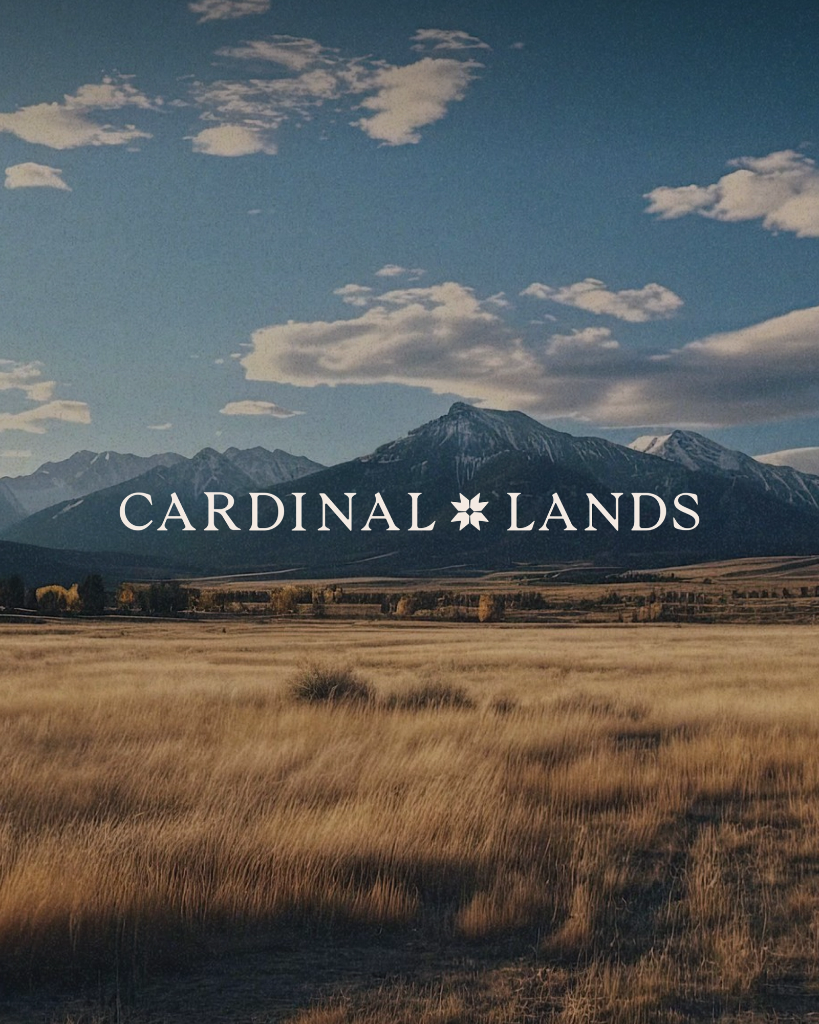
Cardinal Lands is the holding company behind the destinations; a brand that needed to feel rooted, directional, and quietly confident.
The name came from the idea of orientation. “Cardinal” evokes true north, guidance, and American signals. “Lands” brings the brand back to earth, anchoring it in terrain, stewardship, and long-term ownership. Together, they form a name that feels modern and geographic, but also warm and human.
The symbol was born from a pattern found on a vintage quilt. We reinterpreted it into a mark that feels both crafted and structural. The palette, deep reds, greens, and natural neutrals - helps the brand sit comfortably between Western heritage and contemporary design.
The identity became the backbone of the larger system, used across investor decks, acquisition materials, early property concepts, and the first version of the website. It established a tone that was grounded, intentional, and built to expand as the company grew.
Aspects Big Sky is the first Cardinal Lands destination: an end-to-end hospitality experience in Big Sky, Montana.
The founders acquired six acres with ten unfinished townhomes and handed us a rare opportunity; to define a completely new kind of mountain stay, from philosophy to logo to linens.
During COVID, Americans discovered a new rhythm: working remotely from cabins and Airbnbs, rediscovering nature, cooking, hiking, being human again.
When cities called them back, demand for nature-based escapes didn’t disappear. But west of the Mississippi, supply couldn’t keep up.
Set between Bozeman and Yellowstone, Big Sky is a young ski town shaped by striking contrasts: private luxury at the Yellowstone Club on one side and simple hotels in town on the other. The untouched middle ground was wide open, and it became the perfect place for Aspects to take root.
We approached Aspects the way we approach world-building; start with the feeling, then let the story grow outwards. This helped our positioning become clear: a modern mountain stay for people who want to unplug from screens and reconnect with the American outdoors.
“Reconnect with what matters” became the brand’s guiding line. It shows up on signage, on websites, in materials left in each home, and in how guests describe their stay. It turned the property into an antidote to modern life.
The visual system comes directly from the landscape. The palette spans evergreen, dark evergreen, storm, clay, lake, sand, wheat, and prairie snow.
The brand’s style is hand-drawn, tactile, and slightly imperfect; nothing corporate, nothing glossy. We tested the brand on hats, totes, signage, and small merchandise before building the rest.
If it didn’t feel right in someone’s hands, it didn’t belong in the world.
Led by Albert, we treated Aspects like a small village; there’s Eileen’s Canteen, a warm communal building. There is shared sauna and outdoor hot tubs. Shared fire pits, outdoor decks. There’s access to horses and nearby farms. You can have private time, or meet other folks in the ‘village’ during your stay, whether short or long-term.
We created a hand-drawn property map showing routes to Yellowstone and Big Sky, as well as the internal layout of the homes. Each illustration is done in the same touch-by-hand style as the logo.
Every room includes custom materials; notes, notepads, Wi-Fi info, garage storage guidance, and wildlife safety cards. Each part of the experience is calibrated to give a sense of belonging and being able to let your guard down.
The signature entrance signs were designed by Andrea Shine, built by a custom fabricator in Minnesota, then driven to Montana. Aspects guests not only photograph themselves in front of the signs, they sign the backs, further adding to the communal feeling.
To bring Aspects to life, we built a content engine rooted in real experience, not staged setups or empty interiors.
Social manager Crystal Castillo led a creator outreach program that made it easy for families, photographers, filmmakers, and storytellers to visit, stay, and capture the property in their own voice.
We also knew that if we were going to define the feeling of this place, we had to feel it ourselves. Our team went to Big Sky for a full week and lived on the property together.
The Photographer joined the team as they cooked in the kitchens, played board games late into the night, hiked the nearby trails, explored the town, sat around the fire, and watched the light move across the valley each day.
The cameras were always out, but nothing was staged. We wanted to show what it’s actually like to stay at Aspects: the quiet mornings, the warm meals, the messy backpacks, the views from the deck, the soft moments between activities, and the sense of slowing down that happens naturally in a place like Big Sky.
The result was a deep library of imagery filled with warmth, motion, and lived-in texture. Not promotional. Not overly arranged. Just honest scenes of people reconnecting with what matters, which is the heart of the entire brand.
The website extends the brand world online. The site includes property overviews, amenities, home types, experiences, excursions, stories, and direct booking. The interface is built with picture cards, postcards, scenic vistas, and hand illustrations. It feels more like a travel journal than a hotel site. It mirrors what it’s like to actually stay there.
Aspects became the blueprint for how we build hospitality worlds, from dirt and drywall, to identity and UX.
Across the Tetons, in Driggs, Idaho, sits the second destination: a place with the same sweeping views as Jackson Hole, but with more room to breathe, more room to play, and a spark of youthful energy running through it.
If Aspects invites you to slow down, Teton Outing Club moves in the opposite rhythm; built around motion, early mornings, and saying yes to whatever the mountains offer. “Always Go” became the motto.
The tone leans into Americana, camp lore, field notes, and road-trip ephemera. It needed to feel like a club that has existed for decades, even though it’s brand new.
We wanted the brand world to feel like something on a trail sign or scout manual. We leaned into vintage embossing, patches, and travel manuals as inspiration.
The TOC emblem feels like something found on a trail sign or scout manual. The system includes carefully defined embossing, debossing, patches, and stamp treatments.
We chose the mountain bluebird as the mascot, Idaho’s state bird, because it carries a feeling of optimism and movement. We brought it to life as a character, and a small recurring mark that appears throughout the brand.
The typography is intentionally layered, using Goudy, Arizona Sans, JMH Typewriter, and Adobe Handwriting to mirror the mix of voices you’d find in old field journals. We used this diversity of type to evoke logbooks, letters, margin notes, and the kind of outdoor paperwork that gets collected and added to over seasons.
We pushed heavily into what we call “bookmorphism” using parchment textures, cards, Polaroids, thumbtacks, dotted lines, shadows, and archival illustration styles including pencil, gouache, woodcut, and lithograph.
The result feels like a living archive of outings, seasons, weather, and stories.
The digital experience is login-gated, reinforcing the feeling of a club rather than a hotel. Once inside, the world opens into postcards, notes, maps, artifacts, and a tactile navigation system.
Teton Outing Club shows the elasticity of the Cardinal Lands universe. It shares DNA but becomes an entirely new world.
Across Cardinal Lands, Aspects, and Teton, Little Plains delivered naming, architecture, full identities, visual systems, illustration systems, photography direction, content strategy, social playbooks, UX, IA, web design, and digital development. Every detail connects back to one coherent ecosystem.
This isn’t three logos and three websites. It’s a connected hospitality platform.
Cardinal Lands is the backbone. Aspects proves the vision in Big Sky. Teton Outing Club extends the universe with a completely different mood, tone, and aesthetic; while still feeling like it belongs in the same family.
Guests feel the coherence when they arrive. Investors see it in the decks. Creatives recognize the craft. And the Cardinal Lands team now has a long-term foundation to build future destinations without losing the thread.

Cardinal Lands
- Patty Reyes
- Product Manager
- Chris Bolliger
- Brand Design, Web Design, & Development
- Nicole Fernandez
- Copywriter
- Emmett Shine
- Creative Director
- Alex Leiphart
- Head of Product
Teton Outing Club
- Ann-Marie Sebastian
- Product Manager
- Rani Vestal
- Brand Design
- Nicole Fernandez
- Copywriter
- Derek Saffe
- Web Development
- Arthur Shim
- Product/UX
- Austin Mullin
- Motion Design
- Elliot Robinson
- Motion Design
- Emmett Shine
- Creative Director
- Alex Leiphart
- Head of Product
- Michelle Riis
- Account Management
- Laura Romero
- Operations
Aspects
- Patty Reyes
- Product Manager
- Emmett Shine
- Creative Director
- Camille Baldwin
- Brand Strategy
- Lee Tilghman
- Copywriter
- Camille Muson
- Copywriting
- Abby Muir
- Branding & Art Direction
- Crystal Castillo
- Social Media
- Marcel Leif
- Videography
- Gregory Wikstrom
- Photography
- Andrea Shine
- Illustration
- Eileen Vidal
- Illustration
- Issac Martin
- Development
- Rani Vestal
- Graphic Design
- Emmett Shine
- Creative Director
- Alex Leiphart
- Head of Product
- Laura Romero
- Operations